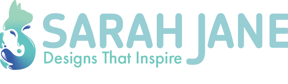
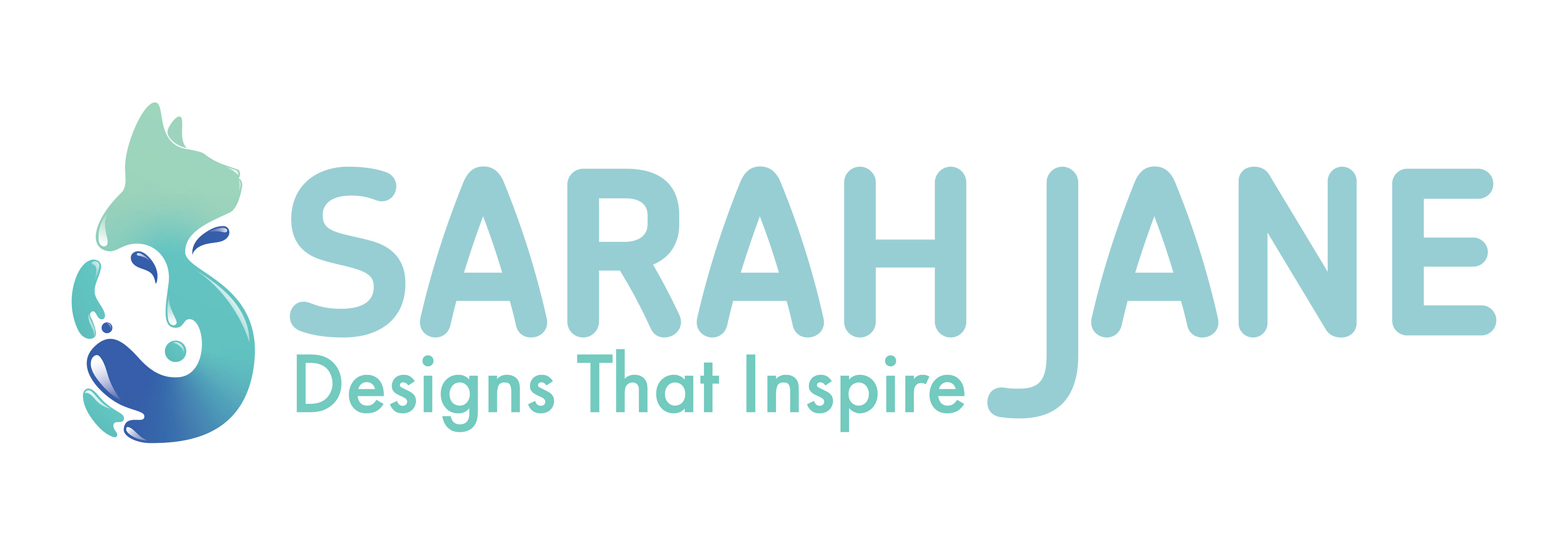
With a new year comes a new change. Over the course of a year, I've managed to learn quite a bit about design throughout my course. Throughout the last year of my course, I decided to revise my personal logo mainly the type and colour.
when first designing the logo I wanted the icon and the text to clash together when It came to the overall shapes and it's something that I managed to achieve. However when I look at my core values and the feelings which I want to convey. The typography wasn't coming across as something that was friendly and inviting. For this time around I chose a type that was more rounded and brought a more friendly and inviting vibe that I was aiming for.
The colours that were used were originally quite bright and loud which at the time felt right however through experimenting with different colours for a different project I found that I gravitated to more pastel/ calmer colours. and decided that changing the logo to a light blue/ green colour palette would be more gentler on the eyes.
2021
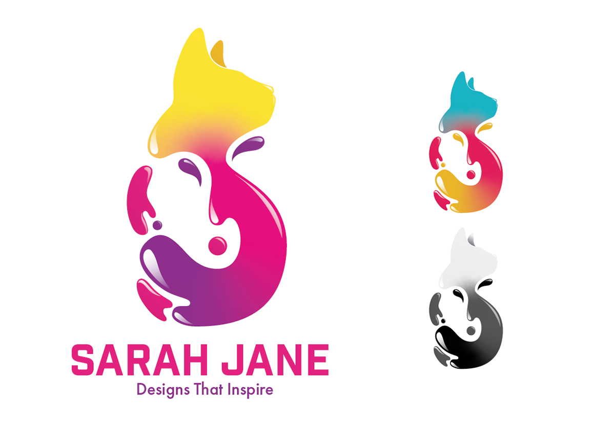
Finished Logo design; Left - Right: Final logo with text, alternative colour set and Grey scale.
Final Logo design animated without text.
PERSONAL BRANDING
For the first project of the year, I was tasked with making a Personal Logo for myself that I could use to promote myself for general use. For the overall design, I ended up creating a brightly coloured cat for my logo.
At first, when I was given the assessment, I wasn’t sure what exactly I wanted to do until I was given the suggestion that I should draw my cat. A proposal that was meant to be a joke turned into my logo as I modified it into a moving liquefied cat that also portrayed my initials.
For the colours of the logo, I decided to go with bright colours so that the logo could stand out on its own while still being able to blend in and work alongside the other projects for the exhibition.
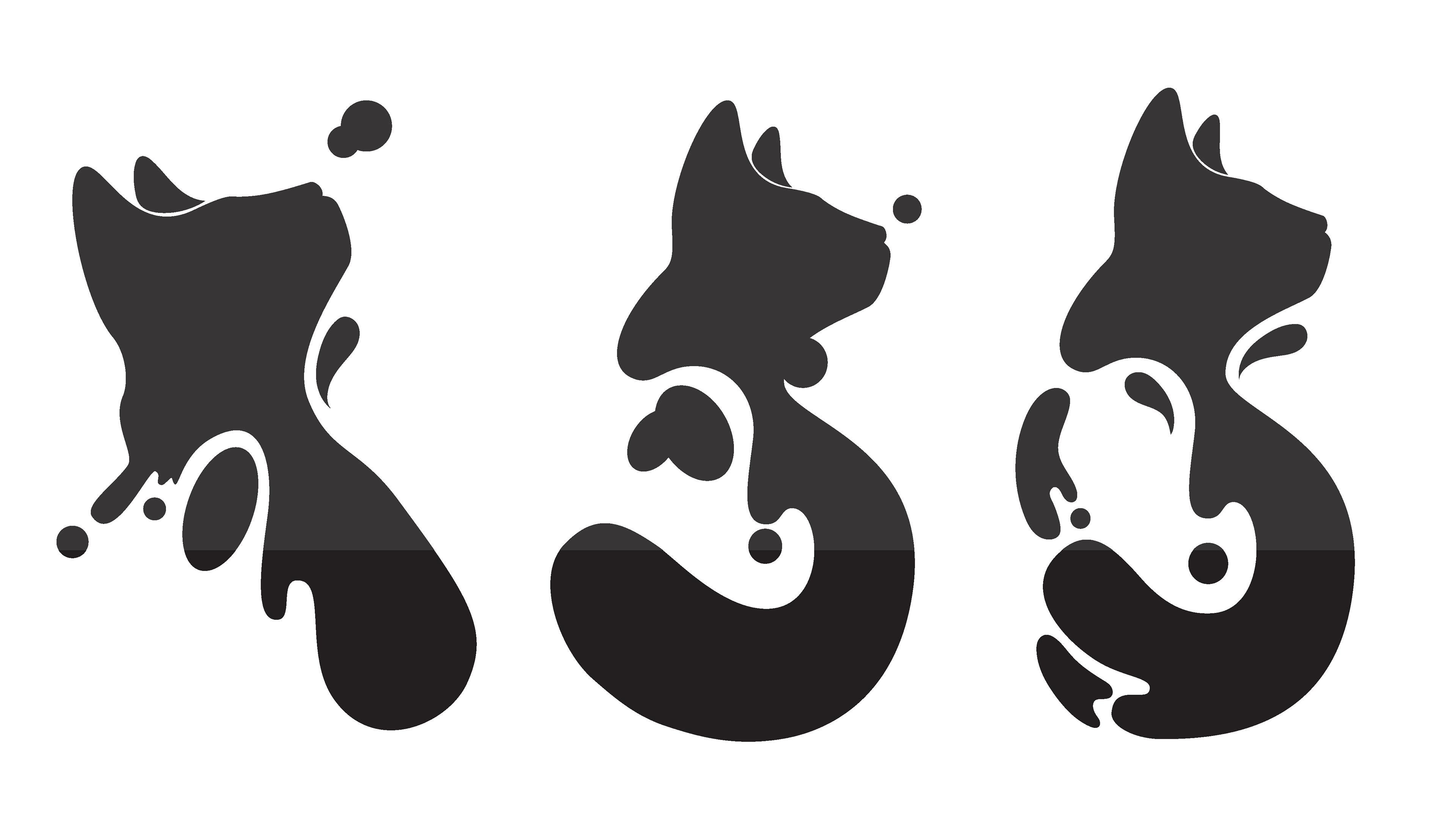
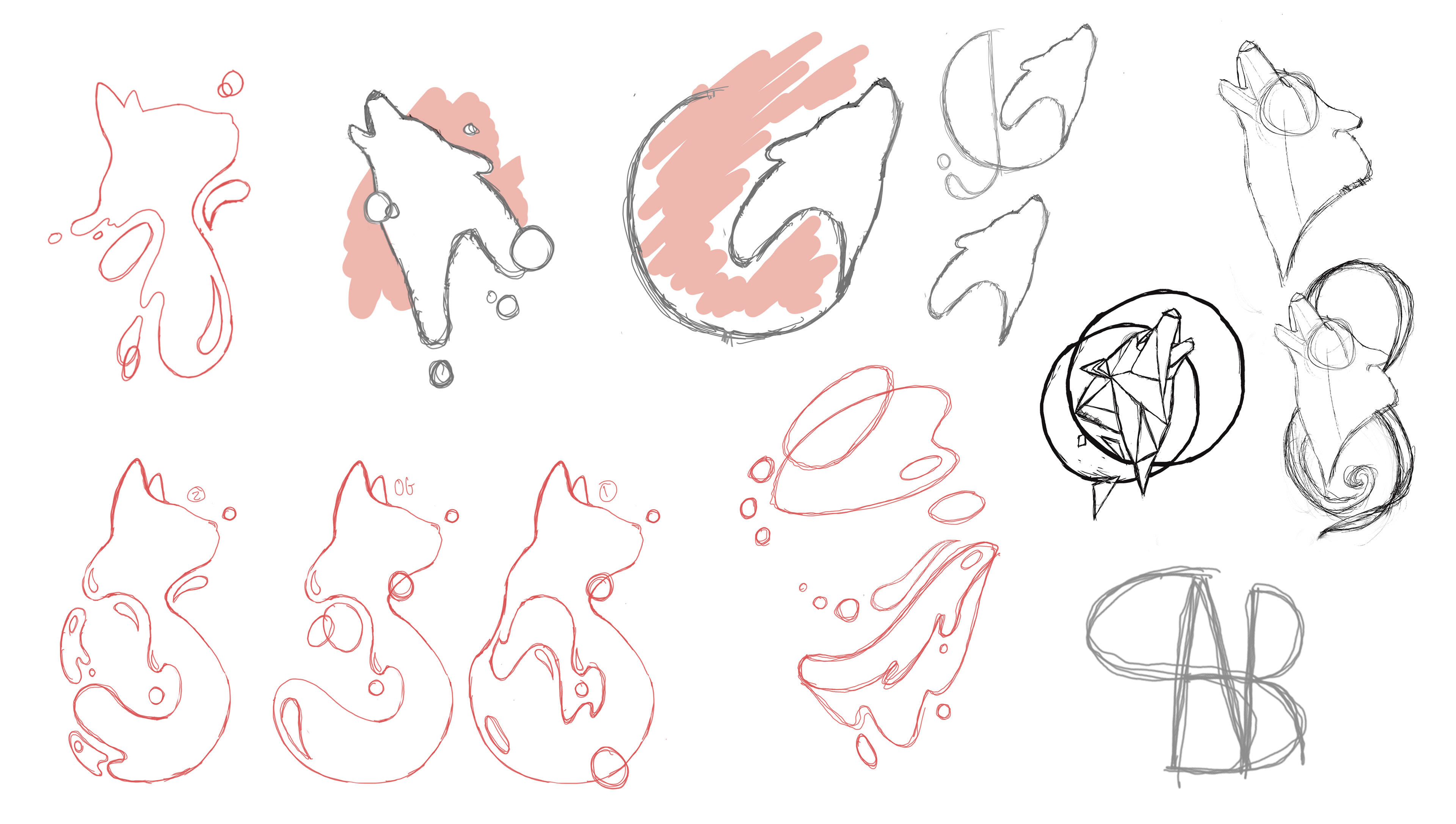
Logo sketches and prototypes