Based on an assessment I received last year, I aimed to revisit and rectify the mistake that I originally made with this project. I mainly wanted to prove that I could execute a packaging design layout correctly.
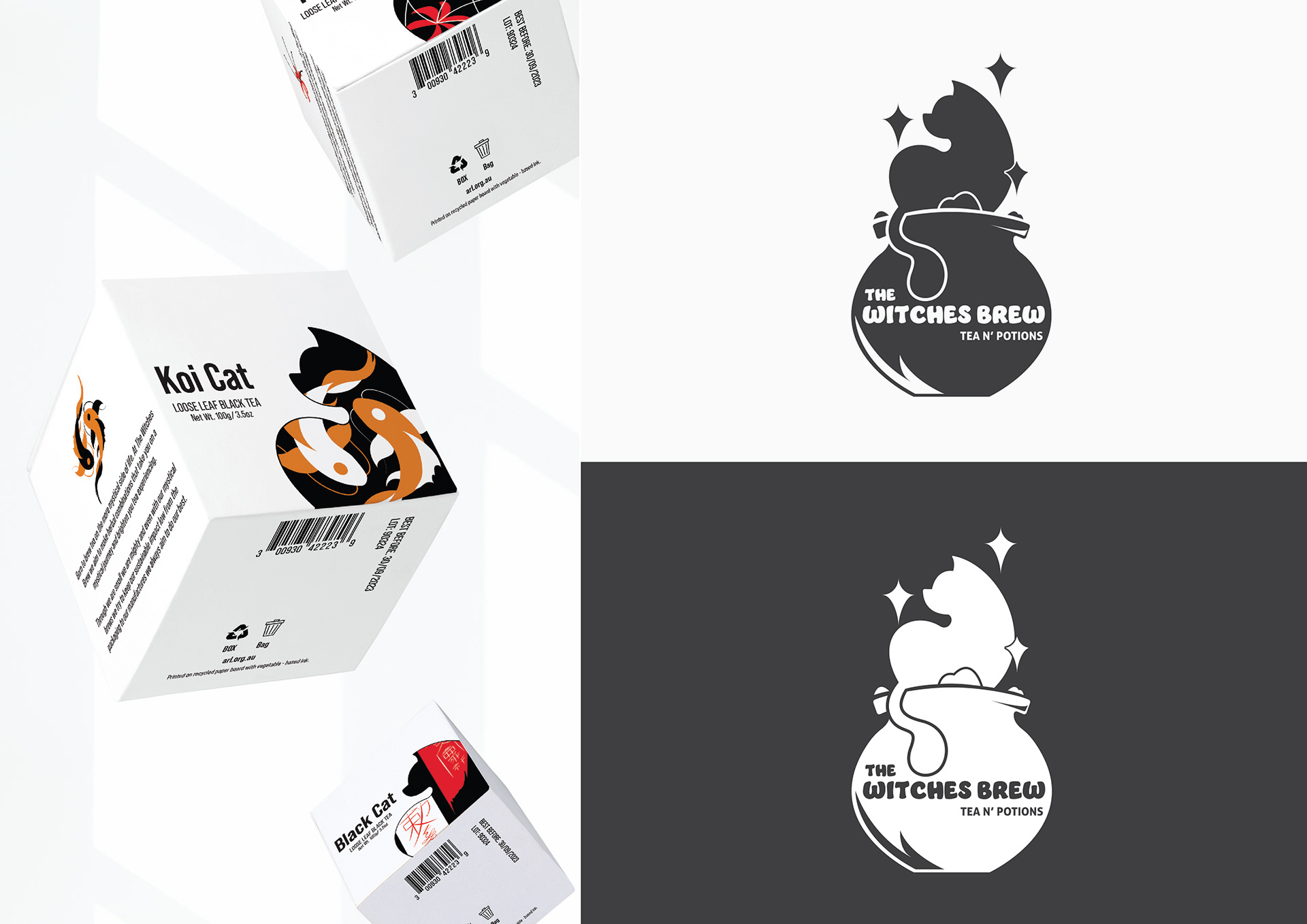
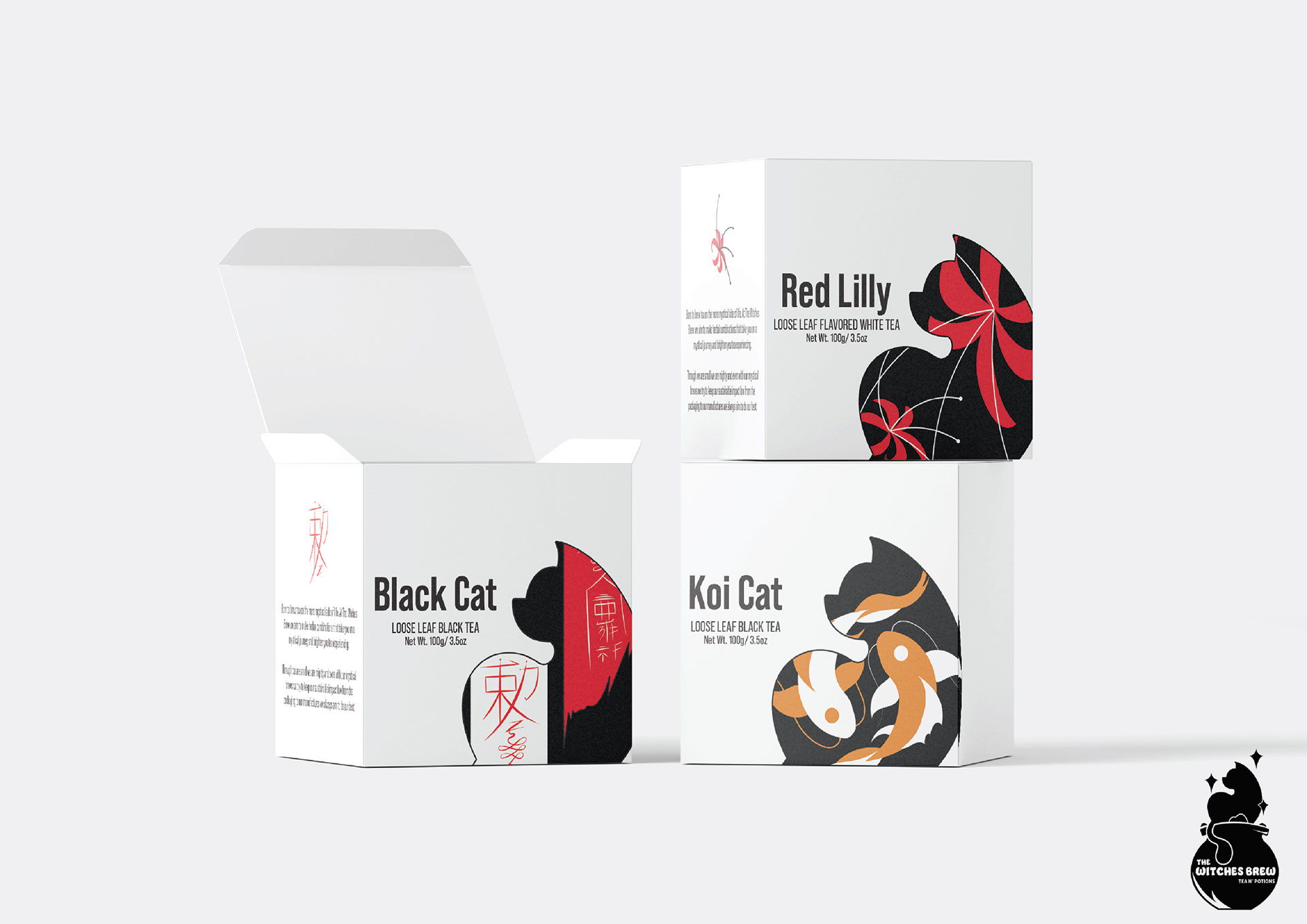
For the design, I wanted to make something more whimsical and decided to design packaging for a tea company called the Witches Brew. For the packaging, I aimed to stick to a limited colour palette, mainly using black and white with orange and red as feature colours to give the illustrations a dark and mysterious feel.
When looking at what type I wanted to use for the tea boxes, I decided to use something quite clean and readable for the amount of information I was planning to include on the boxes. I also didn't want to do something too decorative that would draw too much attention from the illustrations but was also cohesive enough to complement the cat designs. I ended up going with a thin sans-serif typeface.
Mockups from Freepik.com