Final Illustrative piece
EXTENTION OF COLOUR
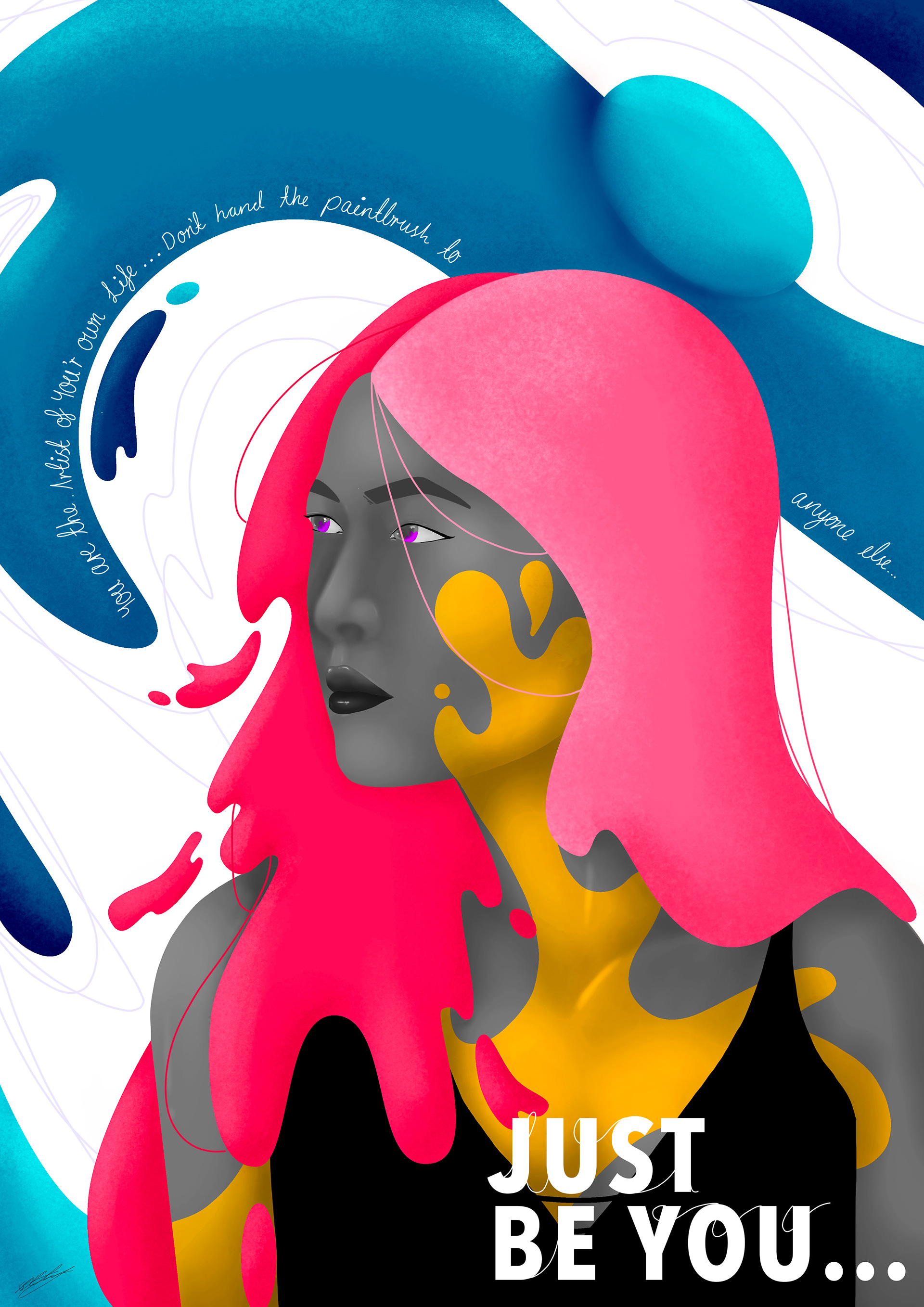
For the custom Piece, we had the opportunity to create anything we wanted with the only constraint/ suggestion being to add text. So being who I am I ended up making an illustrative A3 poster that incorporated the colour palette used throughout the rest of the exhibition pieces.
At the beginning of the semester, I had a vision for the type of colours and art I wanted to display and like many things plans changed due to the vast and inevitable circumstances that the second half of the year brought us my plans changed significantly.
So I decided that my colour palette would change. I wanted to create a piece that portrayed the light and colour dissipating from the world and ultimately created a figure in black and white with shape, line and colour swirling around them.
When completed the image I found that something wasn’t right and that the piece wasn’t exactly what I had wanted to create. With that in mind, I set out to redesign the poster.
The second time around I decided to stick with the original concept and make it so that the colour was leaving the character instead which I feel makes the image more interesting to look at. I also decided to change the text and the message placing one of my favourite quotes.


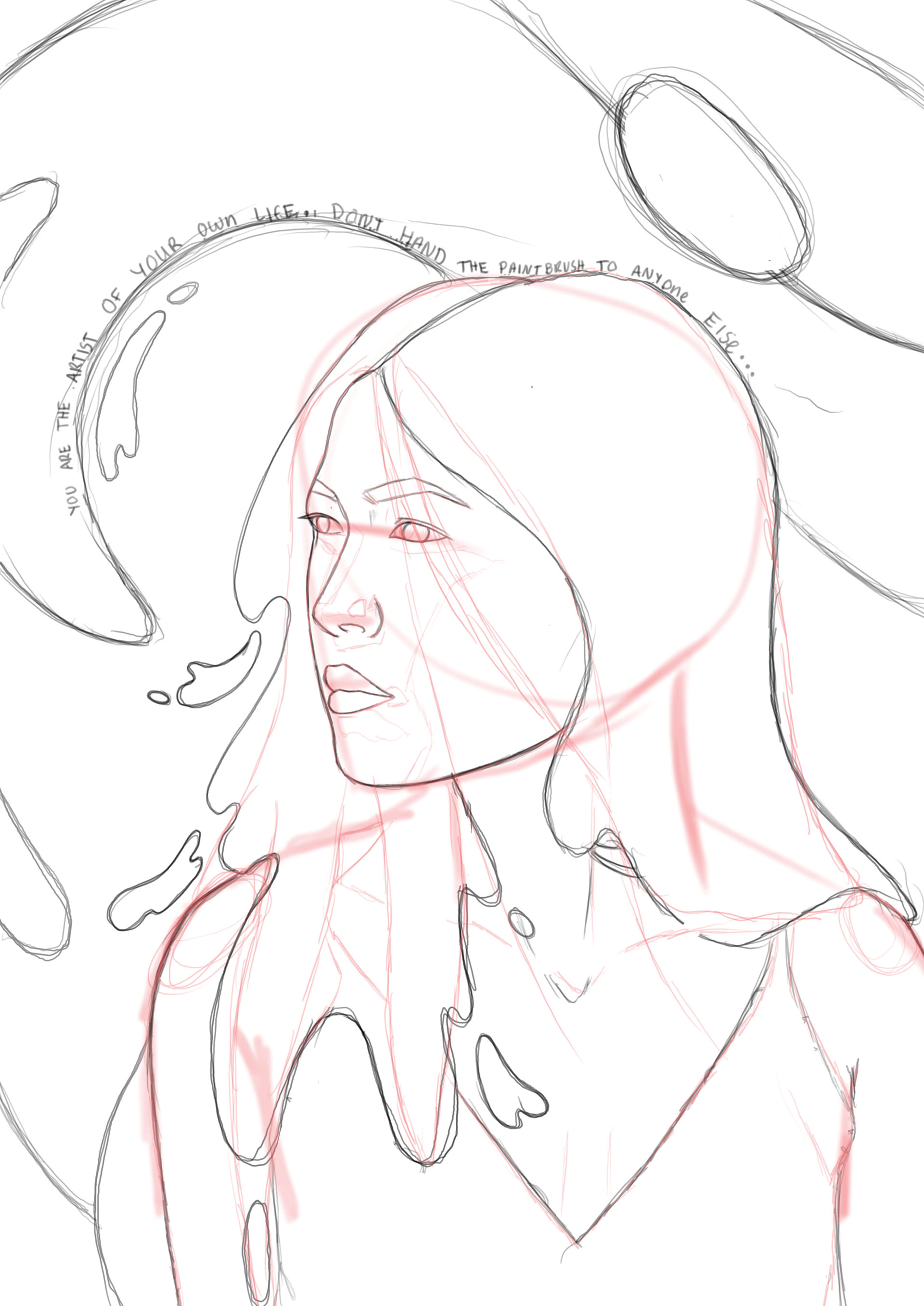
Stage of the art process; From left - right: rough blockout, sketch, final illustration with textual elements.
